
Jacob Marrocco
I am a stickler for logos. It’s really the first thing that draws the eye to a team. History has given fans some absolute gems, and some of the worst images created by man. This is the first in a series of blog posts in which I will count down my favorite and least favorite logos from multiple sports. Next up, my least favorites from NHL history.
10.) Calgary Flames: Alternate, 1998/99-2006/07
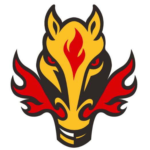
I don’t know why the Flames would stray from the “letters on fire” concept that has done them so well not only in Calgary, but in Atlanta, too. Both were final cuts from the best logos list, but they would have made it in a top 15. This isn’t original, and it just looks silly. I understand the desire to make an alternate logo that is different, but maybe use a puck on fire, or a stick. The horse doesn’t really fit. Why not have a warthog with flames coming out of its nostrils? Or a gazelle? It makes about as much sense as a horse. Not to mention, if you look at it the right way it just looks like a vase…or a bat with its wings wrapped around its body. So, yeah, no me gusta.
9.) Buffalo Sabres: Primary, 2006/07-2009/10
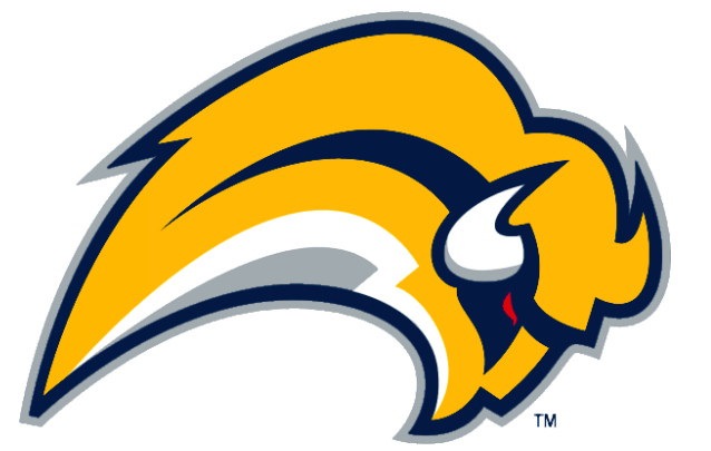
I’ve never understood why this logo was ever used. I think the Sabres have struck gold with their current logo, but this one is just sort of a mess. Are those two vague points at the bottom supposed to be the legs? Where does the face begin and end? Is one horn white and the other yellow? It looks more like an abstract painting than a logo. It’s as though someone threw yellow, blue and white paint onto a canvas and said “Wait, here’s a splash of red.” Just horrible.
8.) Los Angeles Kings: Alternate, 1995/96
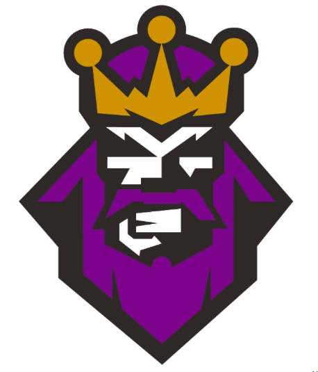
Things aren’t off to a good start with your logo when fans refer to it as the “Burger King” whenever your team wears it. The fact it only lasted one season should shed some light on just how unpopular and, frankly, horrendous this logo is. Is he the King of Bushy Eyebrows? I know the purple is a symbol of royalty, but if you’re going to make a logo look like a king why not go all out? Make the king look regal, don’t just take a viking, slap a crown on him and call him a king. Or, just don’t mess with a good thing.
7.) New York Islanders: Primary, 1995/96-1996
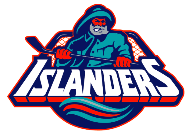
Speaking of messing with a good thing. When the Islanders tried to rebrand themselves with this one, it failed. When I think intimidation, I think the Gorton Fisherman holding a hockey stick. The Islanders logo before and currently is a classic. This is ugly. It isn’t particularly appealing, and it gets bonus bad points for briefly taking the place of one of the best ever. It’s a disservice to spend more time on this. Moving on.
6.) Anaheim Mighty Ducks: Alternate, 2003/04-2005/06
This one might take the award for Alternate Logo that Most Differs from the Primary. The Mighty Ducks logo (spoiler alert) is one of the best in NHL history, so you would imagine the alternates would be even more imaginative. At least that Calgary disaster horse is a creative (albeit hideous) departure from the letters on fire. This looks like something you would see on the sweater vest of a fictitious Ivy League school. It’s bland and thankfully lasted just a short time (because they rebranded, but still).
5.) Buffalo Sabres: Alternate, 1996/97-1998/99

For the first time in this logo series, one team gets featured twice! Congratulations…? Just when I thought the abstract buffalo couldn’t be topped, this takes the cake. I guess Buffalo just refused to include the buffalo AND the saber on the same logo for a while. This is just an alternate, but it is still awful. The “S” looks like a “5” to start, and red really isn’t a color featured prominently with the Sabres. It’s just so unimaginative. It’s like they needed one last logo at the final possible second before submission and someone drew this up. Let’s just be happy the Sabres got themselves together and went back to their original logo.
4.) New York Rangers: Alternate, 1996/97-2006/07
What is the point of this? This goes in the same vein of the Colts and 49ers of 2001 trying to modernize logos that were fine to begin with. The Rangers’ logo has been around for quite some time, so why did someone decide that a good alternate would be to make it 3-D and slightly change the font? The Rangers have some excellent alternates, but this is just unnecessary. Alternates are fine, but leave the classics alone if you’re going to ruin them.
3.) Florida Panthers: Alternate, 2009/10-2011/12
Wow, this is original! So many symbols have come to represent Florida, but let’s choose the sun. The sun isn’t prominent anywhere else, right? Not only that, but let’s use the abbreviation for the state and just attach the sun to it? There is so much detail on the Panthers’ primary logo, it must have been where all the talent went. This isn’t disastrous like the first Sabres’ logo where you just can’t tell what it is. That’s easy to see; yet it’s why it ranks so high. This is barely a logo. Barely. There are impressive wordmark logos out there, it can be done. This isn’t even a wordmark logo; it’s just lazy.
2.) Phoenix Coyotes: Alternate, 1998/99-2002/03
What is this? It certainly isn’t a coyote, I can tell you that. So then what’s the point? There are plenty of alternative Coyotes logos that are actually, you know, coyotes. Sportslogos,net’s description of this logo is simply “desert lizard.” And that’s right. It’s just a lizard. So then why even include this as an alternate? Is it because it lives in the desert, and coyotes live in the desert? It looks like roadkill. There isn’t even anything to say about it. It doesn’t even really count as a team logo. When the Phoenix Lizards start up, reserve this one. Until then, leave it alone. Locked in a room. Surrounded by lasers.
1.) Columbus Blue Jackets: Alternate, 2001/02-2003/04
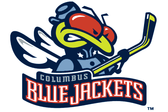
This one is No. 1 for a very special reason. The Columbus Blue Jackets are NOT named after insects! Did anyone stop to think how insane it would look to dress a yellow jacket in a Civil War uniform? Apparently not, because this one lasted as an alternate for a few seasons. The Blue Jackets team name references how Ohio was one of the largest sources of Union soldiers during the Civil War. It does NOT reference a high yellow jacket population. Or at all reference bugs. In any way, shape or form. It was stupid that Columbus ever tried this one out, and it deserves the top spot on this list.
Source: Chris Creamer’s sportslogos.net
